Gallery#
A visual overview of every chart type gufo supports. Each example uses synthetic data and can be copy-pasted as a starting point.
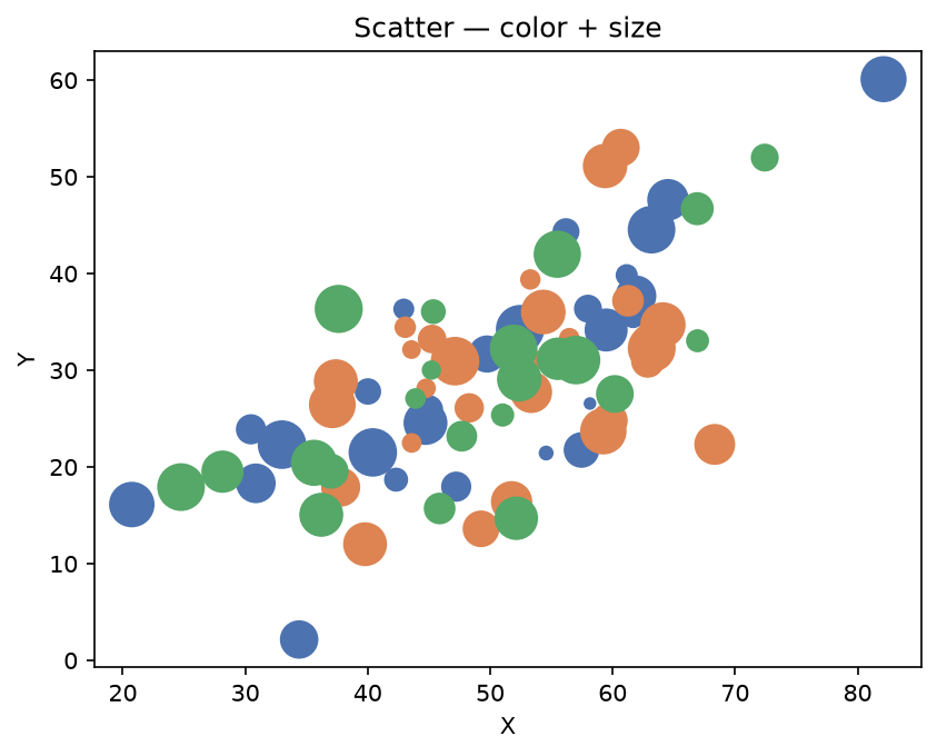
Scatter#
gufo.chart(df).scatter("x", "y", color="category", size="size").show()
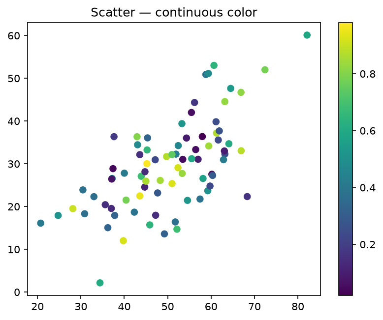
Scatter — continuous color#
gufo.chart(df).scatter("x", "y", color="value", cmap="viridis").show()
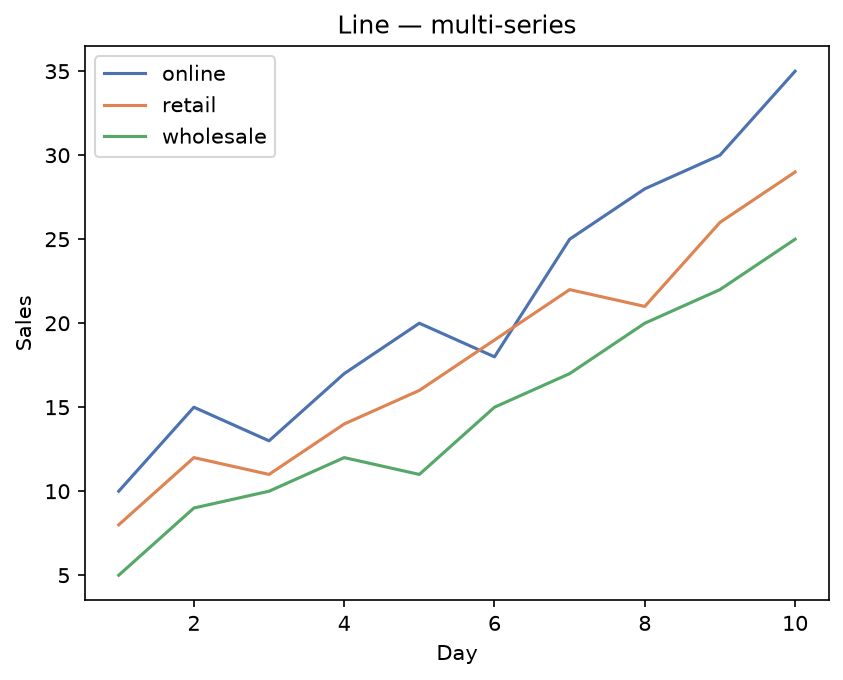
Line#
gufo.chart(df).line("day", "sales", color="channel").legend().show()
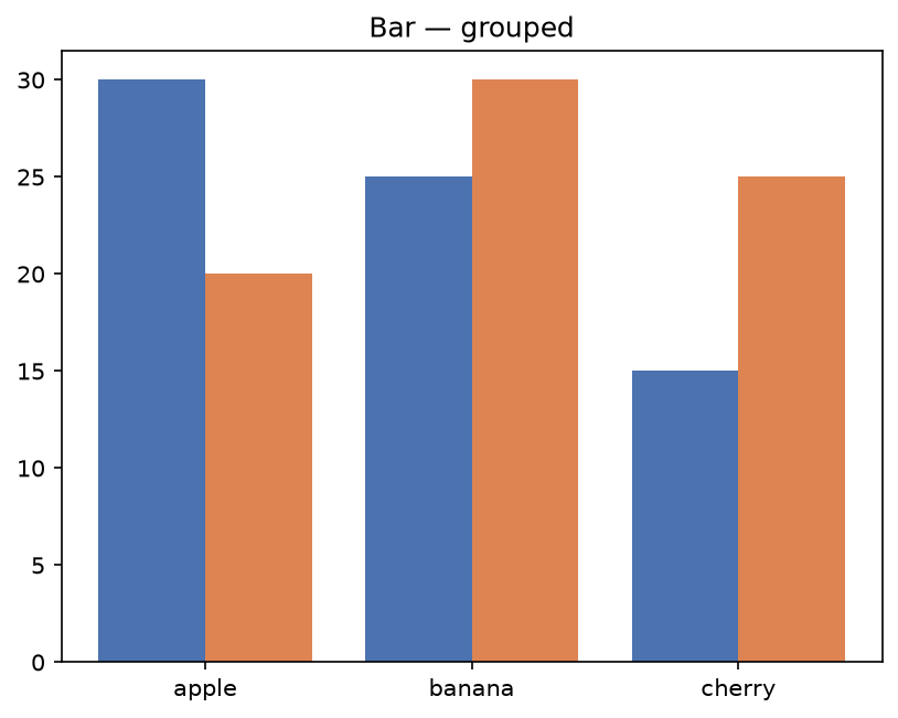
Bar — grouped#
gufo.chart(df).bar("fruit", "count", color="region").show()
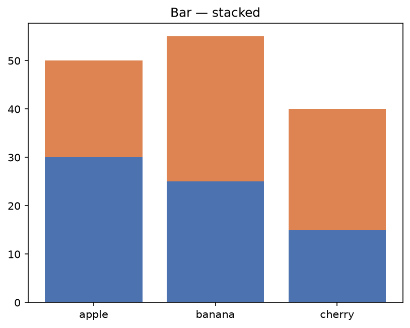
Bar — stacked#
gufo.chart(df).bar("fruit", "count", color="region", stacked=True).show()
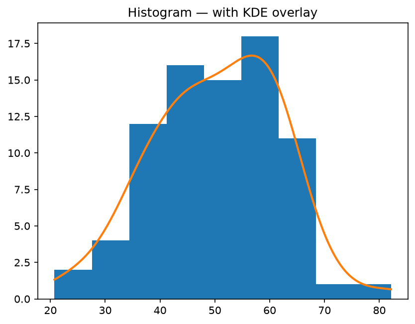
Histogram with KDE#
gufo.chart(df).histogram("x", kde=gufo.kde()).show()
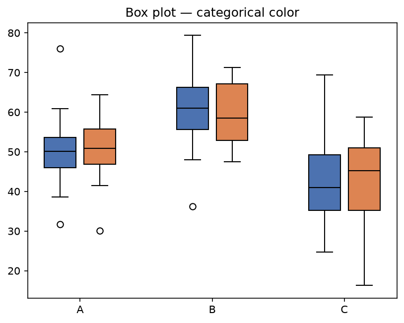
Box plot#
gufo.chart(df).boxplot("group", "value", color="sub").show()
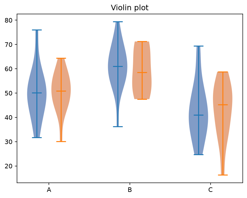
Violin#
gufo.chart(df).violin("group", "value", color="sub").show()
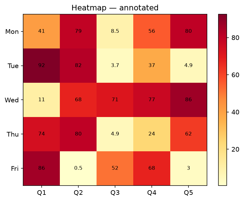
Heatmap#
gufo.chart(pivot_df).heatmap(annotate=True, cmap="YlOrRd").show()
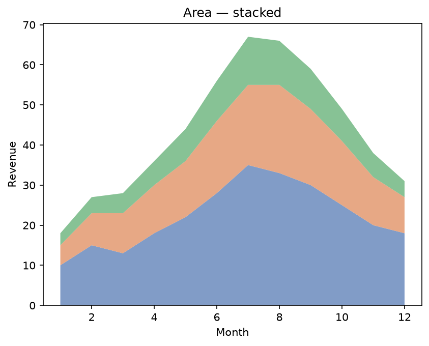
Area — stacked#
gufo.chart(df).area("month", ["product_a", "product_b", "product_c"]).show()
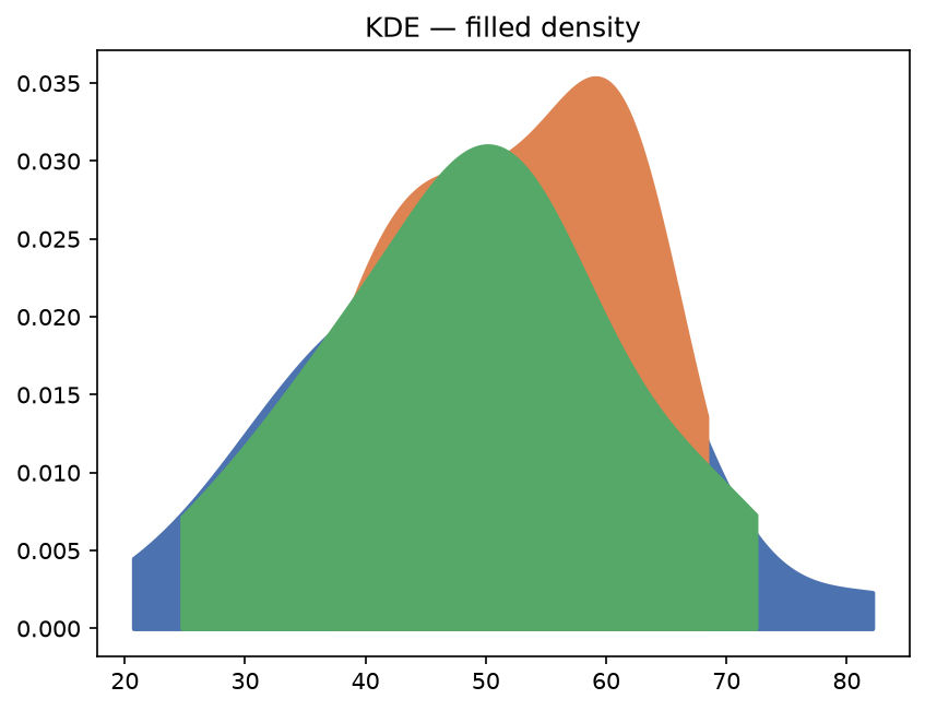
KDE — filled density#
gufo.chart(df).kdeplot("x", fill=True, color="category").show()
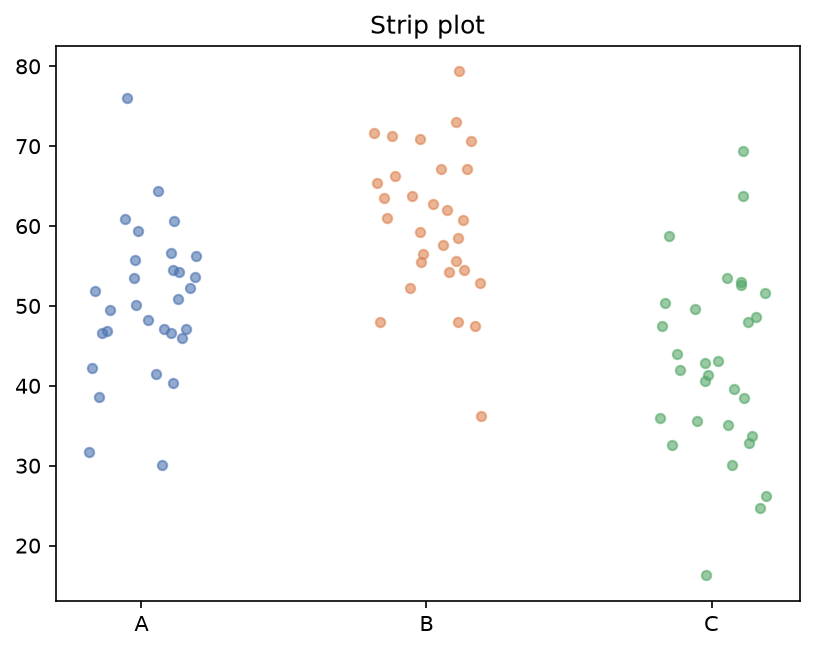
Strip plot#
gufo.chart(df).strip("group", "value", color="sub", alpha=0.6).show()
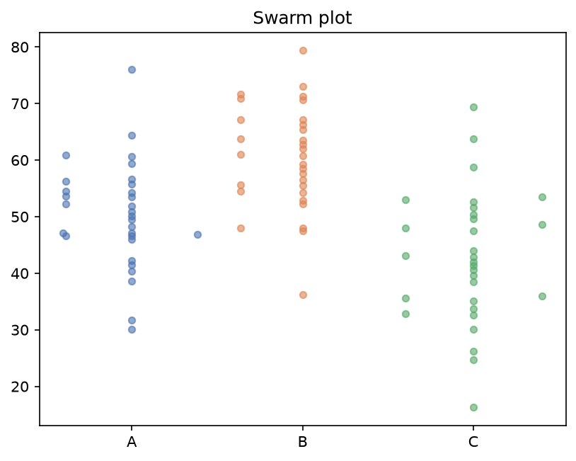
Swarm plot#
gufo.chart(df).swarm("group", "value", alpha=0.6).show()
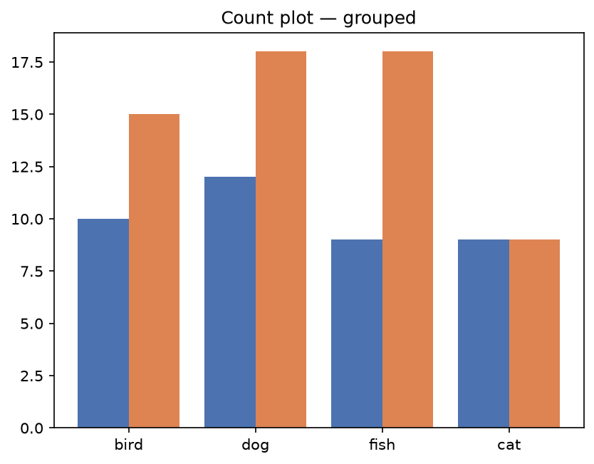
Count plot#
gufo.chart(df).countplot("animal", color="owner").show()
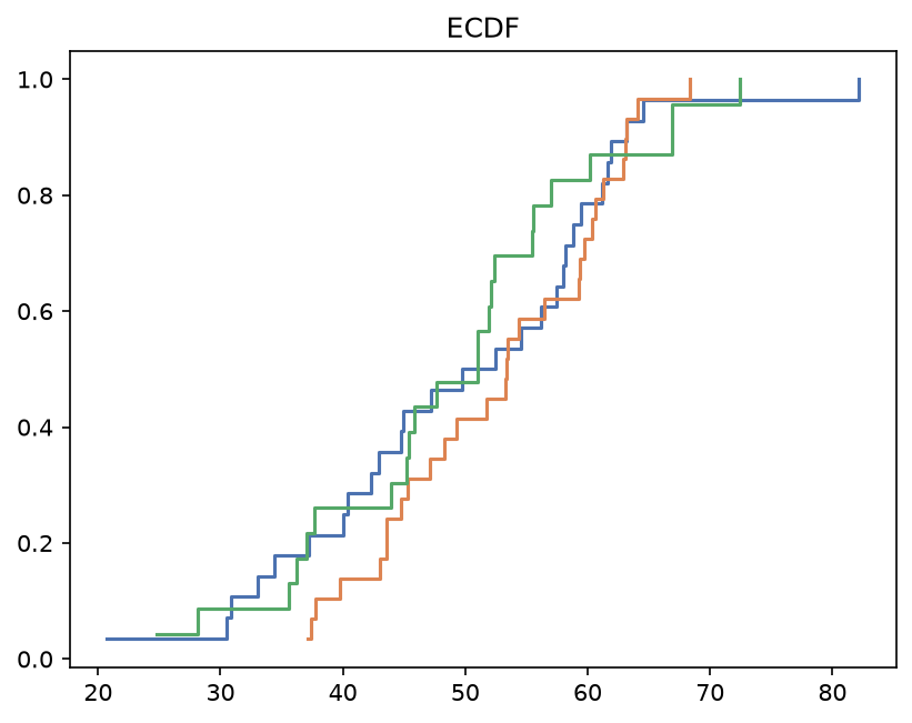
ECDF#
gufo.chart(df).ecdf("x", color="category").show()
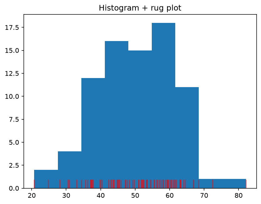
Histogram + rug plot#
gufo.chart(df).histogram("x").rug("x", color="red").show()
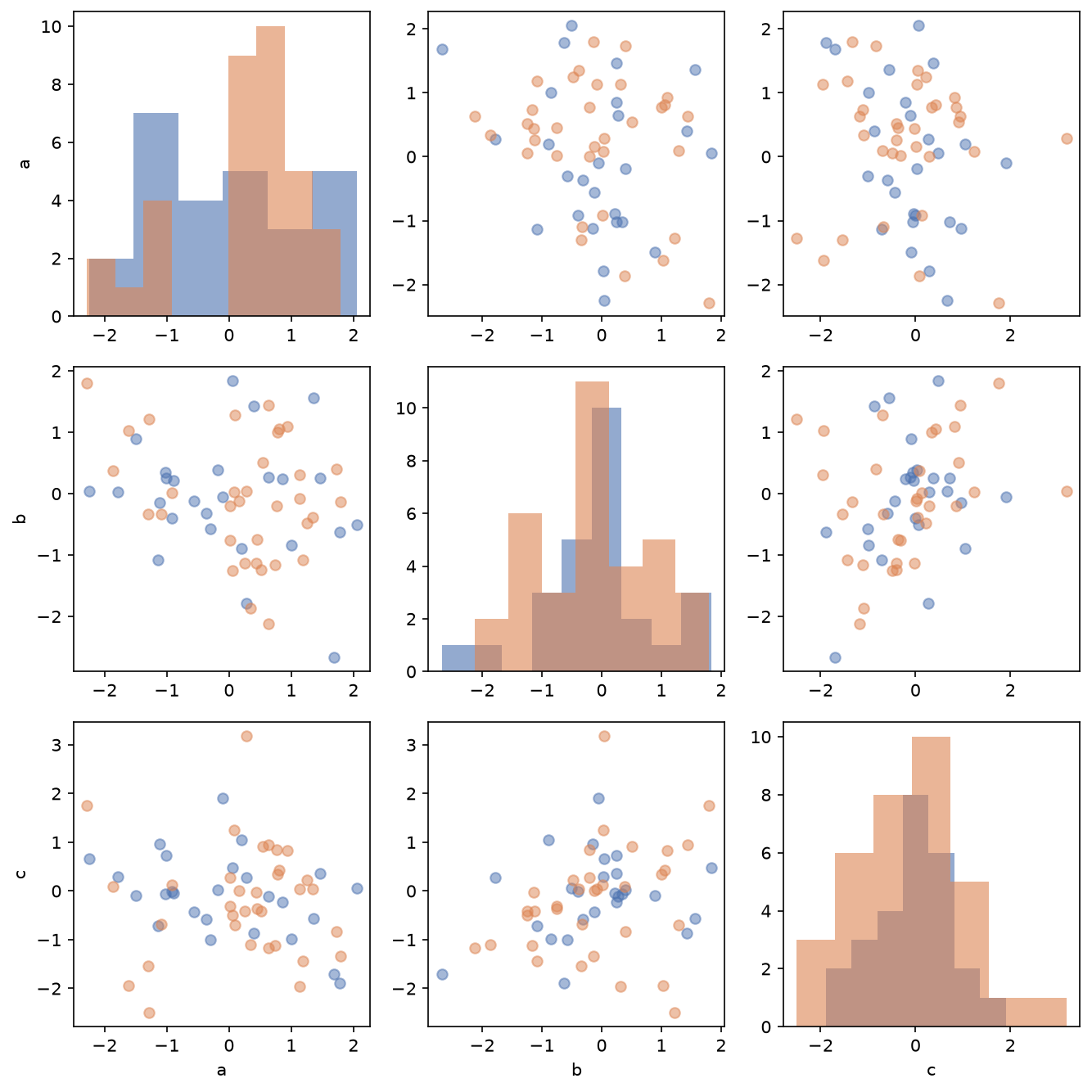
Pair plot#
gufo.pairplot(df, ["a", "b", "c"], color="species").show()
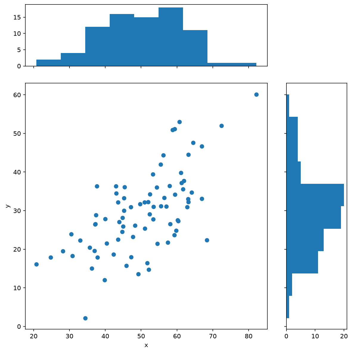
Joint plot#
gufo.jointplot(df, "x", "y").show()
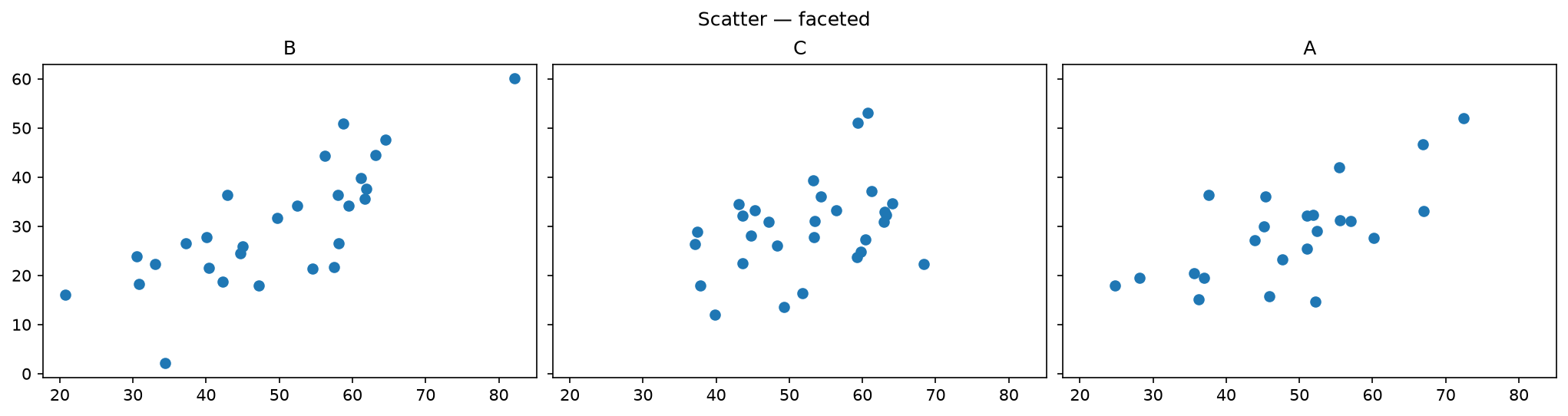
Faceted scatter#
gufo.chart(df).scatter("x", "y").facet("category").show()